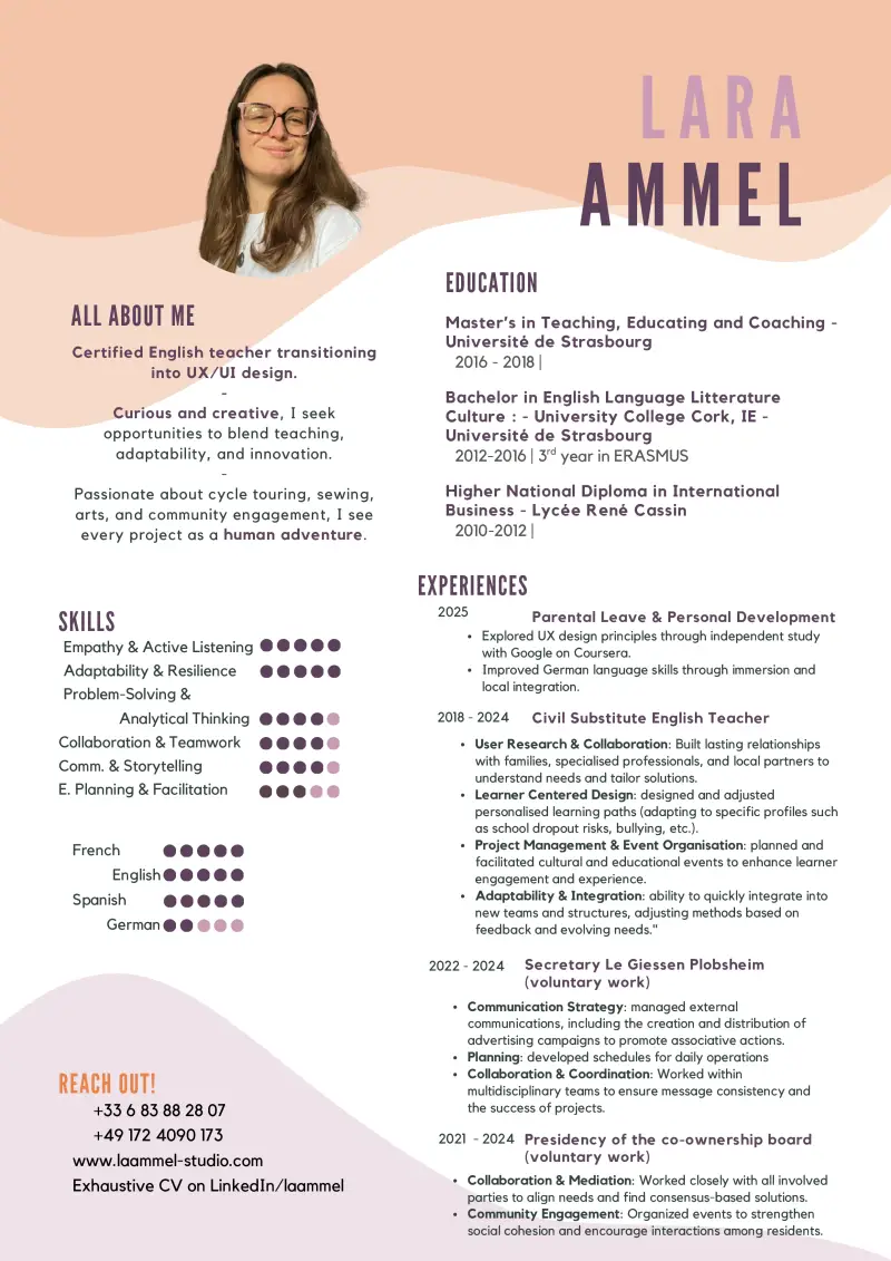
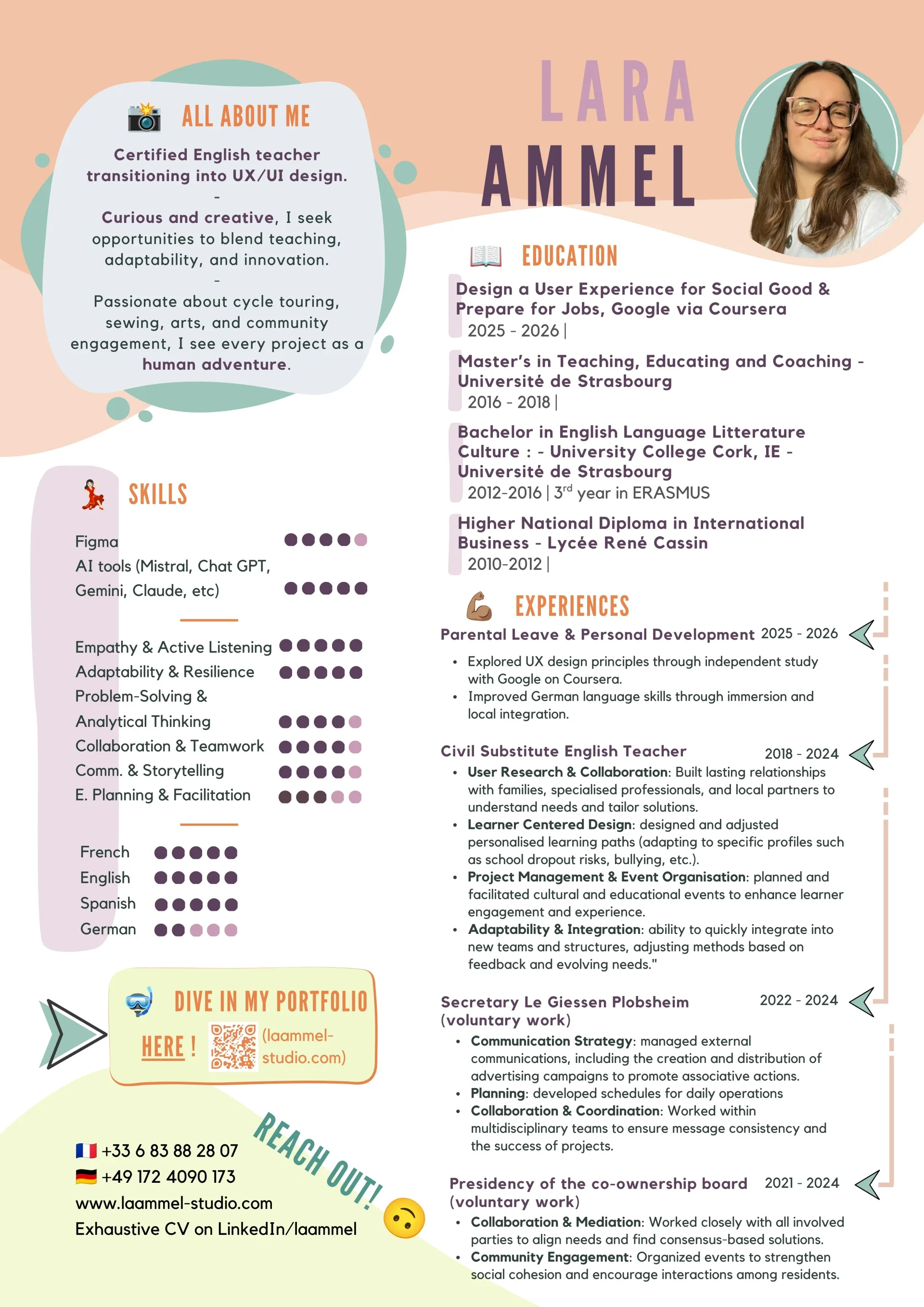
My resume was designed in a rather classical - perhaps even old-fashioned - style. The previous versions dated back to 2018, which is almost 10 years ago! So, I decided to analyse my initial design and improve it, focusing on the design (not the content).
Main strengths:
✅ Visually appealing
✅ Readable (colours, typeface, size, contrast)
✅ Clear structure
Main weaknesses:
⚠️ Feels heavy and blocky (not engaging to read)
⚠️ Lacks dynamism
⚠️ UX education and skills are missing (content-related)
⚠️ Design skills don’t shine through
⚠️ My joyful and dynamic personality don’t shine through
The result is great! I'm pleased with the outcome and I think it might have been liked by potential employers as I have a first interview for an internship very soon 🥳.
Next up: analysing and redesigning my portfolio, as it shares many of the same weaknesses 💪🏽.
Add comment
Comments